
Priced for Perfection, Quantified: When Great Earnings Aren't Enough

By Chad Hartman
Published · Last updated
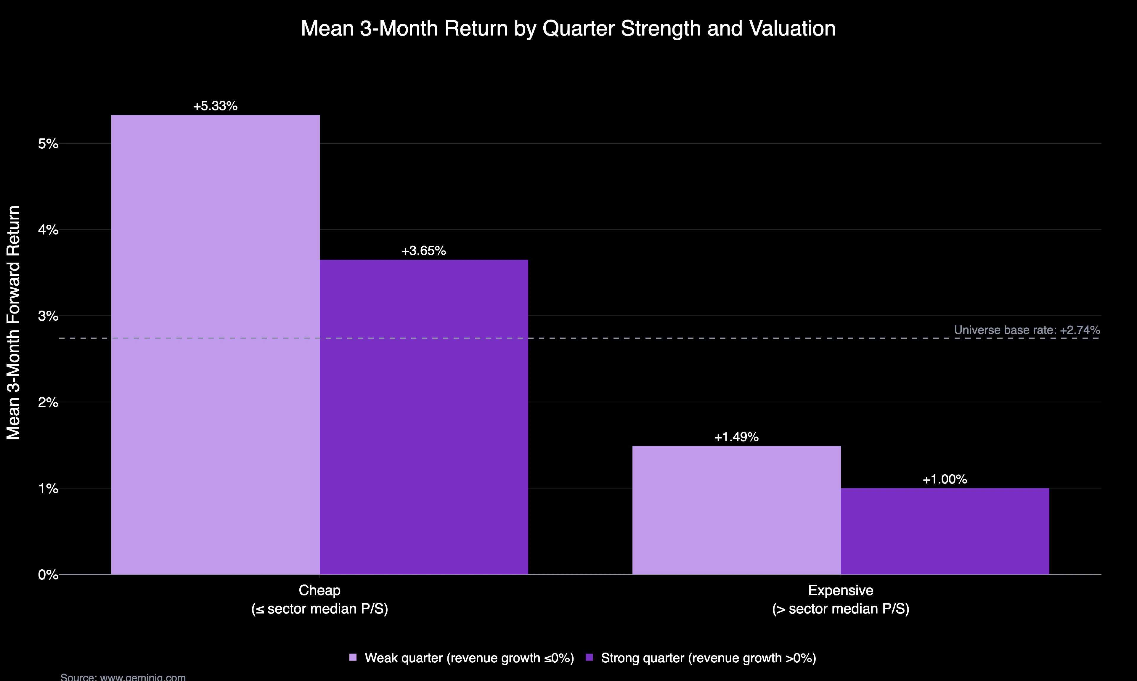
"Priced for perfection" describes a stock whose price already assumes the good quarter it is about to report — so a strong result changes nothing and anything less breaks the story. Measured across 111,782 as-filed quarterly filings, quarters that were both strong (positive revenue growth) and expensive (a Price-to-Sales Ratio above the company's own sector median) returned a mean +1.00% over the following three months, against a universe base rate of +2.74% — the weakest of the four buckets in this study.
In July 2011, Netflix beat earnings estimates by more than 13%, grew revenue 51.7% year-over-year, and had already run up 63.5% for the year heading into the print. Three months later the stock was down more than half. The quarter itself was good. The price had already priced in a better one.
That pattern has a name investors reach for constantly — "priced for perfection" — and until now it has mostly lived as a vibe, not a number. GeminIQ's as-filed data can quantify it directly: every quarter where trailing revenue grew year-over-year, crossed with whether the stock traded above or below its own sector's valuation, joined to what happened over the next three months.
This study reads 111,782 quarterly filings — 10-Qs and 10-Ks, excluding financial-sector issuers — from 3,283 companies in GeminIQ's as-filed database, filed between February 2011 and May 2026, joined to each stock's cumulative return over the three months following the filing date.
Strong Quarters at Expensive Prices Returned the Least
Split every filing two ways: did trailing revenue grow year-over-year, and did the stock trade above or below the median Price-to-Sales Ratio (P/S) of every other company filing under the same four-digit SIC code that quarter. Four buckets fall out, and valuation — not the quarter itself — does almost all the work.
Quarters that were both strong (positive revenue growth) and expensive (P/S above the sector median) were followed by the weakest returns of any bucket over the next three months. Quarters that were weak (revenue growth at or below zero) and cheap (P/S at or below the sector median) were followed by the strongest. Whether the quarter itself was good barely moved the outcome once valuation is held constant. The expensive column underperformed the cheap column in both rows, by a wider margin than the strong column outperformed the weak column in either.
Three-Month Returns by Quarter Strength and Sector-Relative Valuation
| Quarter | Valuation | N | Mean 3-Month Return | Median 3-Month Return |
|---|---|---|---|---|
| Weak (revenue growth ≤0%) | Cheap (≤ sector median P/S) | 22,250 | +5.33% | +2.18% |
| Weak (revenue growth ≤0%) | Expensive (> sector median P/S) | 19,127 | +1.49% | 0.00% |
| Strong (revenue growth >0%) | Cheap (≤ sector median P/S) | 33,725 | +3.65% | +1.48% |
| Strong (revenue growth >0%) | Expensive (> sector median P/S) | 36,680 | +1.00% | 0.00% |
Across the full eligible sample, the universe base rate over the same three-month window is +2.74% mean, +0.73% median. Every bucket above is measured against that base rate, not against zero — three months after any random filing in this window, the average stock was already up, because the sample sits inside a long bull market. The strong-and-expensive bucket returned roughly a third of the base rate. The weak-and-cheap bucket returned nearly double it.
This is a historical association across GeminIQ's filing sample, not a forecast for any individual stock. Every figure above is winsorized at the top and bottom 1% of returns so a handful of extreme quarters can't carry the result, and every bucket clears the 200-filing floor this series requires before drawing a conclusion by a wide margin.
Netflix, Etsy, Peloton, and Snap: Four Priced-for-Perfection Quarters
Four names carry this pattern in ways that are hard to forget — and not all for the same reason.
| Company | Quarter | Revenue Growth | P/S | Sector Median P/S | 3-Month Return |
|---|---|---|---|---|---|
| Netflix | July 2011 | +51.7% | — | — | -56.9% |
| Etsy | November 2021 | +61.7% | 11.81 | 2.80 | -45.1% |
| Peloton | November 2021 | +72.7% | 6.44 | 0.82 | -51.4% |
| Snap | April 2022 | +38% | 13.21 | 4.17 | -49.7% |
Netflix already opened this piece. Its July 2011 quarter is close to a textbook case: earnings beat consensus by more than 13%, revenue grew 51.7% year-over-year, and the stock had already run up 63.5% year-to-date heading into the print. Three months later it was down 56.9%, as a controversial price hike and, weeks later, the short-lived "Qwikster" split turned an expensive, growing stock into a cautionary tale.
Etsy's November 2021 quarter beat on both revenue and earnings, and the stock popped more than 13% the next day. GeminIQ's data shows trailing revenue growth of 61.7% against a Price-to-Sales Ratio of 11.81 — more than four times the 2.80 sector median that quarter. None of that was wrong three months later, when the position was down 45.1%. What changed wasn't Etsy's business; it was every expensive growth stock getting repriced at once as the market rotated out of 2021's pandemic winners.
Peloton's November 2021 quarter is the honest exception on this list — it missed Wall Street's revenue and EPS estimates and came with a guidance cut, and the stock fell 36% in a single after-hours session. What still puts it in this bucket is trailing revenue growth of 72.7% against a Price-to-Sales Ratio of 6.44, nearly eight times its sector's 0.82 median — the business was still growing fast by GeminIQ's own filed numbers even as the deceleration became impossible to ignore. Three months out, the position was down 51.4%.
Snap's April 2022 quarter looked fine on its face — revenue grew 38%, daily users beat guidance — but its own forward guidance came in below what the Street wanted, at a Price-to-Sales Ratio of 13.21 against a 4.17 sector median. The real break came a month later: a rare mid-quarter warning that even the lowered guidance wouldn't hold sent the stock down 43% in a single session, its worst day ever, and dragged the rest of digital advertising down with it. The position was down 49.7% three months after the April filing.
How Sector-Relative Valuation Was Measured
Revenue strength comes from GeminIQ's pre-calculated Net Revenue TTM Growth 1Y; valuation comes from Price-to-Sales Ratio (P/S), compared against the median P/S of every other filing under the same four-digit SIC code that quarter rather than the market as a whole, so an expensive software name isn't judged against a cheap grocery chain. Financial-sector issuers (SIC 6000–6799) are excluded, since P/S is a poor fit for banks and insurers. Full methodology — including how the winsorizing, the base-rate comparison, and the 200-filing floor are applied — is covered in How GeminIQ Builds Filing Data Studies.
How to Check If a Holding Is Priced for Perfection
This isn't a screen that requires a study to run. Pull up any position in GeminIQ's Calculated Metrics view and check its Net Revenue TTM Growth 1Y and Price-to-Sales Ratio (P/S), then check GeminIQ's Earnings Market Reaction Heat Map to see how the position has already traded since its last filing. Open the Stock Screener, filter to the same four-digit SIC code, and sort by P/S TTM to see where the position actually sits against its own peers, not the market as a whole. A holding with strong revenue growth trading above its sector's median P/S is sitting in the bucket that returned the least in this study — worth knowing before the next print, not after it.
Frequently Asked Questions
What does "priced for perfection" mean?
It describes a stock trading at a price that already assumes the best plausible version of its next quarter. Because the good result is already in the price, a strong quarter gives the stock nothing new to react to, and anything short of the assumption removes something. In this study the phrase is given a measurable definition: a filing where trailing revenue grew year-over-year and the stock's Price-to-Sales Ratio sat above the median of every other company filing under the same four-digit SIC code that quarter. Those quarters returned a mean +1.00% over the next three months against a +2.74% base rate — the weakest of the four buckets.
Is a high Price-to-Sales Ratio always a warning sign?
No. This study never uses a fixed multiple, because what counts as high depends entirely on the sector: Etsy's 11.81 sat against a 2.80 sector median, while Peloton's lower 6.44 sat against a 0.82 median and was the more extreme reading of the two relative to its peers. The finding is also an association across a large sample, not a verdict on a position — the expensive-and-strong bucket still returned a positive +1.00% mean over three months, just less than the universe did.
What counts as an "expensive" quarter in this study?
A filing where the stock's trailing Price-to-Sales Ratio (P/S) sat above the median P/S of every other company filing under the same four-digit SIC code that quarter — a sector-relative threshold, not a fixed multiple.
How many filings does the strong-and-expensive bucket cover?
36,680 quarterly filings across the sample window, well above the roughly 200-filing floor this series requires before drawing a conclusion from a bucket.
Does a strong, expensive quarter mean a stock will fall?
No. The study reports what quarters carrying these two traits were historically followed by across a large sample — a historical association over the sample window, not a forecast for any specific position.
Why does valuation seem to matter more than whether the quarter itself was good?
Across all four buckets, the expensive column underperformed the cheap column by a wider margin than the strong column outperformed the weak column — suggesting the starting price does more work than the quarter's headline growth number, once both are measured against the same sample.
Research Faster. Invest Smarter.
Most financial websites rely on third-party aggregators that simplify or process data before you ever see it. We built GeminIQ because we believe you deserve a better fundamental analysis tool—one that goes beyond basic price charts and processed numbers. We extract our data directly from SEC 10-K and 10-Q filings to ensure that when you look at a balance sheet or a cash flow statement, you are seeing the numbers exactly how the company reported them. Our goal is to give you the tools to verify the narrative for yourself using clean, traceable data. Start researching now at GeminIQ.com.
Data Appendix: Universe of 3,283 companies outside the financial sector (SIC 6000–6799 excluded), drawn from GeminIQ's as-filed 10-K and 10-Q database, publicly available on SEC EDGAR. 111,782 quarterly filings, filed February 2011 through May 2026, make up the eligible sample (non-null Net Revenue TTM Growth 1Y, Price-to-Sales Ratio, sector code, and three-month forward return). Post-filing returns are cumulative from each filing's filed date, winsorized at the top and bottom 1%, and never compounded. "Expensive" and "cheap" are determined against each filing's own four-digit SIC code median Price-to-Sales Ratio for that quarter, not a fixed threshold. The universe base rate (+2.74% mean / +0.73% median three-month return) is computed from the same eligible sample. Methodology: How GeminIQ Builds Filing Data Studies.
Disclaimer: The content in this blog is for educational and entertainment purposes only and does not constitute financial, legal, or tax advice. Investing involves risk, including the loss of principal. The views expressed are my own and not intended as financial advice or a guarantee of future performance.