
Financial Metrics for Value Investors: A Lululemon Case Study

By Chad Hartman
Published · Last updated
Most lists of "financial metrics every investor should know" are alphabetized junk drawers — ROIC next to dividend yield next to current ratio, with no indication of which one to check first or what a bad number actually means in context. A real research process does not move alphabetically. It moves in a sequence: confirm the business is good before asking if it's cheap, confirm the cash is real before trusting the earnings, and confirm the balance sheet can survive a bad year before getting attached to the growth story. This post follows that sequence end to end on a stock currently splitting the value investing community down the middle: Lululemon ($LULU), which filed its Q1 Fiscal 2026 10-Q on June 4, 2026, for the quarter ended May 3, 2026, with the stock down roughly 50% over the trailing year. Every figure below traces to that filing.
Table of Contents
- Step 1: Confirm the Business Is Actually Good
- Step 2: Follow the Cash, Not the Earnings
- Step 3: Stress-Test the Balance Sheet
- Step 4: Confirm the Growth Is Real
- Step 5: Determine Whether the Price Reflects the Business
- Step 6: Check Operational Efficiency
- Step 7: Check What Insiders and Institutions Are Doing
- Step 8: Verify Every Number Against the Filing
- FAQ
Step 1: Confirm the Business Is Actually Good
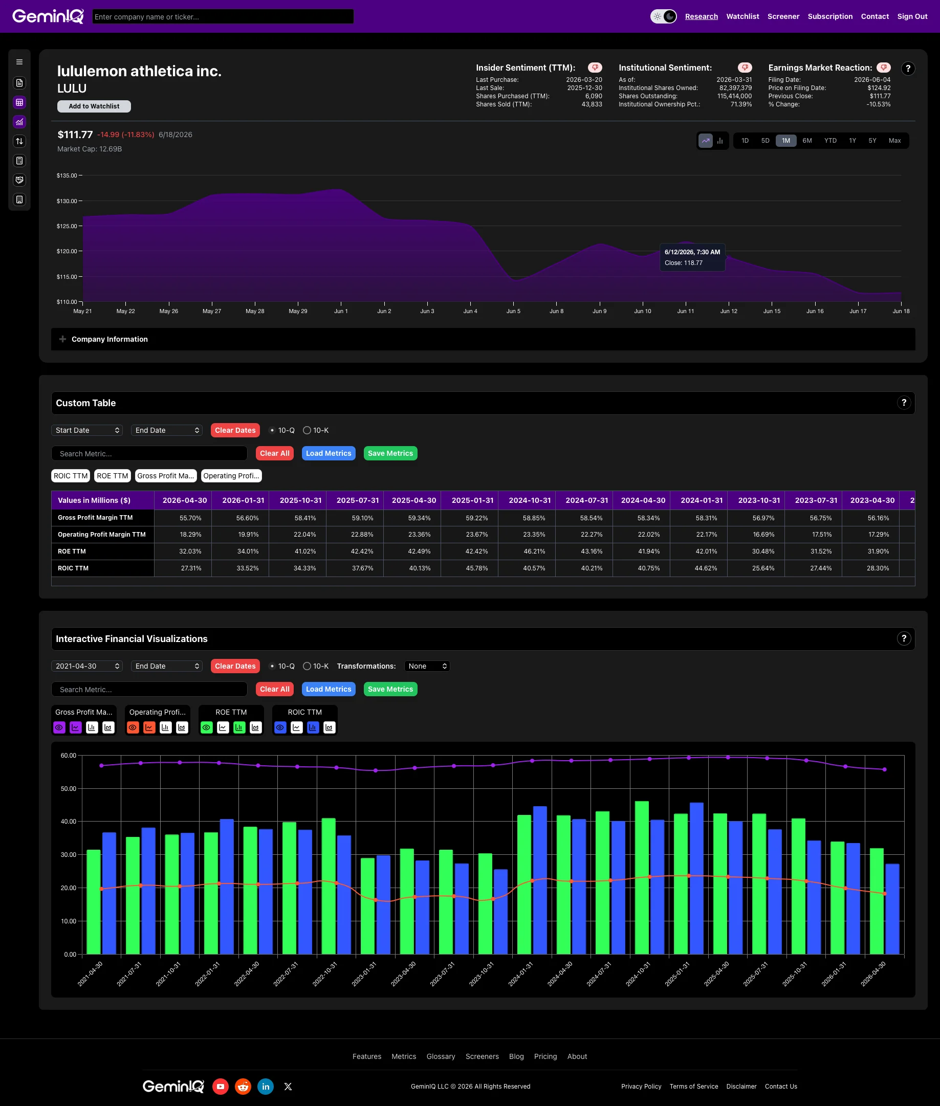
A cheap stock attached to a mediocre business is not a value opportunity — it is a value trap with better marketing. Before any valuation work, the first metric to check is GeminIQ's pre-calculated Return on Invested Capital (ROIC), which measures how many cents of after-tax operating profit a company generates for every dollar of capital — debt and equity combined — invested in the business. A ROIC consistently above 15% is strong; above 25% is exceptional.
Lululemon's ROIC TTM, pulled directly from its Q1 FY2026 10-Q, sits at 42.94% — far beyond the exceptional threshold, built on a 55.70% Gross Profit Margin TTM and an 18.29% Operating Profit Margin TTM. Return on Equity (ROE) runs at 32.03% TTM. The direction is where the real information sits: ROIC has compressed from 74.60% at the January 2025 fiscal year end to 42.94% now, with gross margin easing from 59.22% to 55.70% across the same six quarters. That is a business normalizing off an extraordinary peak, not one breaking down — a company destroying value does not post 42%+ returns on capital while it's allegedly falling apart.
ROIC is built from two further GeminIQ-calculated inputs: Net Operating Profit After Tax (NOPAT), which comes to $1.44 Billion TTM for Lululemon, and Invested Capital, averaging $3.36 Billion over the trailing period. A standard screener stops at the headline stock chart. Pulling the raw income statement and balance sheet through GeminIQ's Calculated Metrics is what separates a declining stock price from a declining business — and on this filing, those are two different things.
Step 2: Follow the Cash, Not the Earnings
Net income is an opinion; cash is a fact. GeminIQ's pre-calculated Free Cash Flow — operating cash flow minus capital expenditures — is harder to manage than an accrual-based earnings figure. Free Cash Flow Yield, which expresses FCF as a percentage of market capitalization, answers the valuation question directly. Above 5% is generally attractive.
Lululemon's Free Cash Flow runs to $1.28 Billion TTM, putting Free Cash Flow Yield at 8.05% — above the attractive threshold despite the depressed share price, because the cash generation hasn't fallen nearly as far as the stock has. On a per-share basis, that's Free Cash Flow Per Share of $11.09 TTM and Operating Cash Flow Per Share of $16.77 TTM — the cash generation holds up at the per-share level, which is the level that actually matters to a shareholder.
Stock-Based Compensation to Revenue is worth checking at this stage for any company, since SBC add-backs can flatter operating cash flow at capital-light tech businesses where it runs into the double digits as a percentage of revenue. For Lululemon, it isn't a story: Stock-Based Compensation totals $71.99 Million TTM, just 0.64% of revenue — the cash flow figure here is close to clean.
Free cash flow tells the story net income is structurally unable to tell.
Step 3: Stress-Test the Balance Sheet
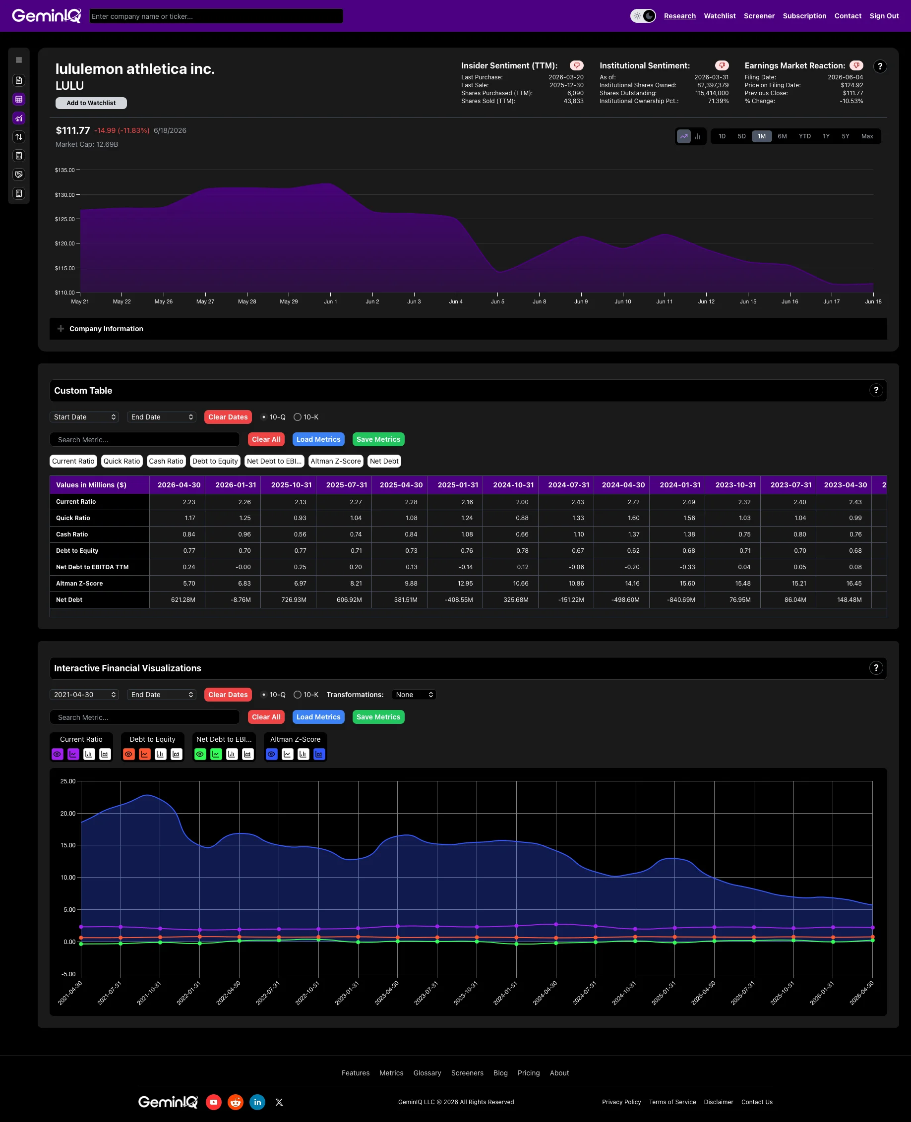
A great income statement does not matter if the company cannot survive its own balance sheet. Current Ratio, Quick Ratio (Acid-Test Ratio), and Cash Ratio test short-term liquidity at progressively stricter levels. Lululemon posts a 2.23x Current Ratio, a 1.17x Quick Ratio, and a 0.84x Cash Ratio — current assets cover current liabilities more than twice over, and that holds even stripping out inventory entirely.
Leverage is where the as-filed data diverges hardest from the screener version. Lululemon carries $0 in interest-bearing debt. Net Debt is therefore negative — $1.51 Billion of cash against no borrowings — which puts Net Debt-to-EBITDA at -0.59x, a net cash position rather than a leverage ratio. The $2.14 Billion that most sources report as Lululemon's debt is operating lease liabilities under ASC 842, split $357.2 Million current and $1.78 Billion non-current, and leases are not notes. GeminIQ's Debt-to-Equity Ratio of 0.77x measures total liabilities against total equity, which is why it reads as leverage on a company that has none. The same fact explains why Interest Coverage Ratio returns nothing here: reported interest expense TTM is $0, and a ratio built around interest expense breaks when a company's debt doesn't generate any.
For a single composite read on bankruptcy risk, GeminIQ's pre-calculated Altman Z-Score comes in at 5.70 — well clear of the 2.99 safe-zone threshold. A stock down 50% is not, on this balance sheet, a distress situation.
Step 4: Confirm the Growth Is Real
A business can look cheap on trailing earnings and still be a poor investment if it's shrinking. Revenue Growth, Earnings Per Share Growth, and Net Income Growth checked across 1-year, 3-year, and 5-year windows tell a more complete story than any single year.
Lululemon's 1-year Revenue Growth is 4.22% — still positive, but a sharp deceleration from its 31.84% 3-year and 125.13% 5-year growth rates. EPS Growth tells the sharper version of the same story: -15.61% over 1 year against 68.48% over 3 years. Net Income Growth is down 19.26% over the trailing year, and Net Profit Margin Growth is down 22.53% — margin compression, not just a revenue slowdown, is what's actually driving the earnings decline. This is the one section where the bearish narrative is grounded in real numbers, not just sentiment: growth has decelerated and margins have compressed in the data, not just in the coverage.
Deferred Revenue Growth is a metric worth checking for subscription and prepaid-revenue businesses, but it doesn't apply here — Lululemon is a retailer with no meaningful deferred revenue balance, a reminder that not every metric in this workflow belongs in every analysis.
A real deceleration is not the same thing as a broken business. But it is the legitimate part of the bear case — which is exactly why quality (Step 1) and balance sheet survival (Step 3) carry more weight here than they would for a company simply growing more slowly from a position of strength.
Step 5: Determine Whether the Price Reflects the Business
Only after quality, cash, balance sheet risk, and growth have been checked does the valuation question mean anything. Price-to-Earnings Ratio (P/E) for Lululemon sits at 10.89x TTM — against a 42.94% ROIC and a 32.03% ROE, that's a quality business priced like a mediocre one.
EV/EBITDA comes in at 5.60x, and EV/EBIT at 7.02x — both well inside the 8x value-territory threshold, against an S&P 500 median running roughly 12x to 14x. A full breakdown of when to lean on which multiple is covered in EV/EBITDA vs. P/E: Which Multiple to Use. Price-to-Book Ratio (P/B) is 3.29x, Price-to-Sales Ratio is 1.42x, and Price-to-Cash-Flow Ratio is 8.21x — every multiple in this section is measuring the same gap between price and business quality from a different angle. Market Capitalization stands at $15.89 Billion against an Enterprise Value of $14.38 Billion — enterprise value sits below market cap, because the net cash comes out rather than debt going in.
What's notable is the path the price took to get this cheap. GeminIQ's Price Variance tracker shows that after Lululemon's FY2025 10-K (filed March 17, 2026), the stock actually rose 2.88% in the first month — then fell 17.64% by month two and 28.28% by month three. The steepest part of the decline happened well after the filing data was already public, which means a large share of the move was sentiment catching down to a re-rated narrative, not new fundamental information arriving in the interim.
No single valuation multiple settles the question, but four of them pointing the same direction is harder to dismiss than one.
Step 6: Check Operational Efficiency
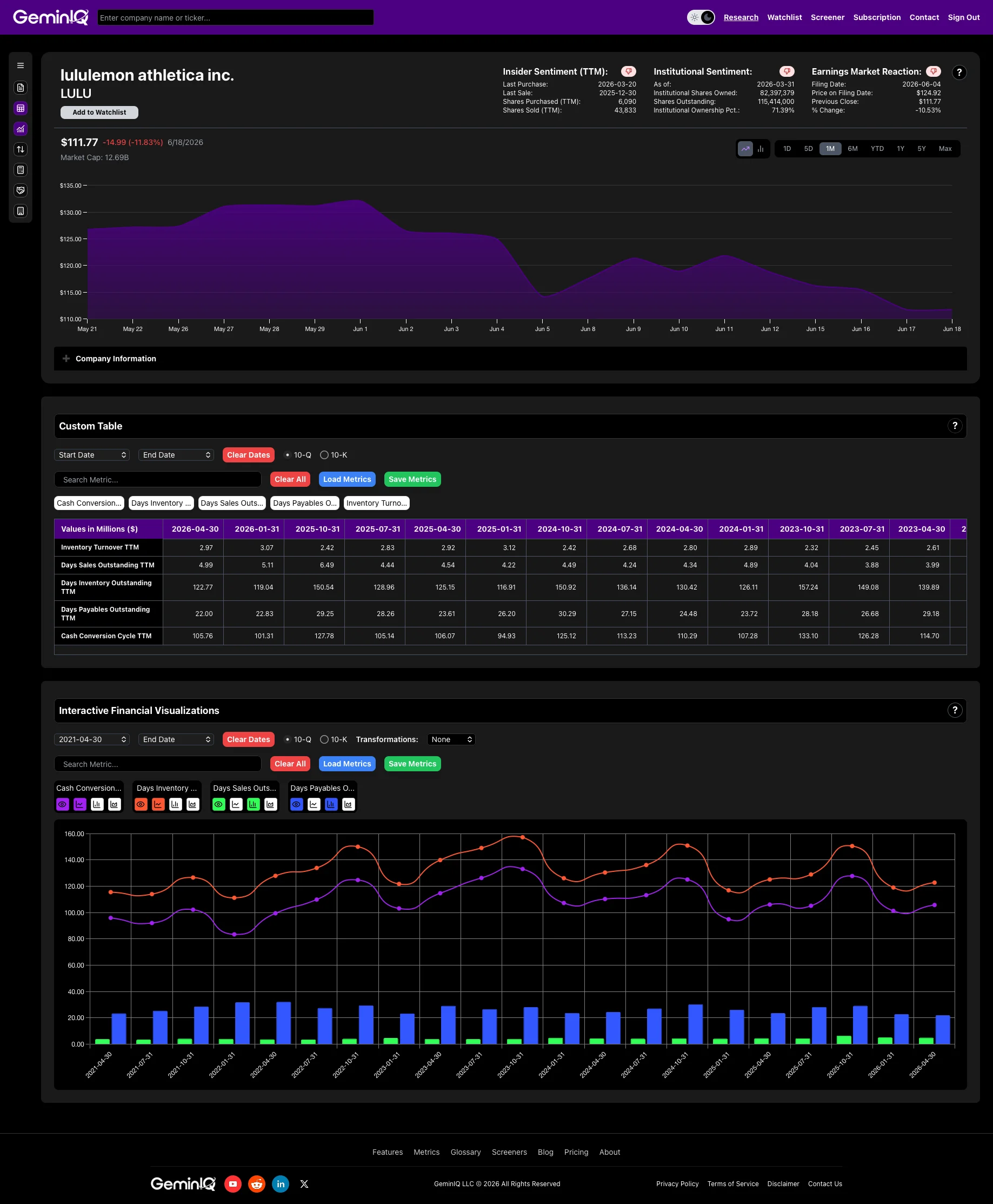
This is the section where Lululemon's own filing data confirms part of the bear case instead of refuting it. Operational efficiency metrics matter most for retailers, manufacturers, and distributors — businesses where management's handling of inventory and working capital doesn't show up in a margin figure at all. Asset Turnover runs 1.40x TTM and Inventory Turnover 2.97x TTM — both unremarkable on their own, but the components beneath inventory turnover are where the real signal sits.
The number that stands out is Days Inventory Outstanding: 122.77 days TTM — inventory is sitting for roughly four months before it sells, which lines up directly with the heavier markdown activity and promotional discounting management has cited as a margin headwind. Days Sales Outstanding is just 4.99 days, reflecting a retailer collecting cash at the point of sale, but Days Payables Outstanding of only 22.00 days doesn't offset the slow inventory turn. Combined, GeminIQ's pre-calculated Cash Conversion Cycle (CCC) comes to 105.76 days TTM — a meaningfully long stretch between paying for inventory and collecting cash from the sale.
This is the metric that confirms a real operational problem, not just a sentiment problem — and the workflow is just as useful for surfacing the legitimate part of a bear case as it is for refuting the exaggerated parts.
Step 7: Check What Insiders and Institutions Are Doing
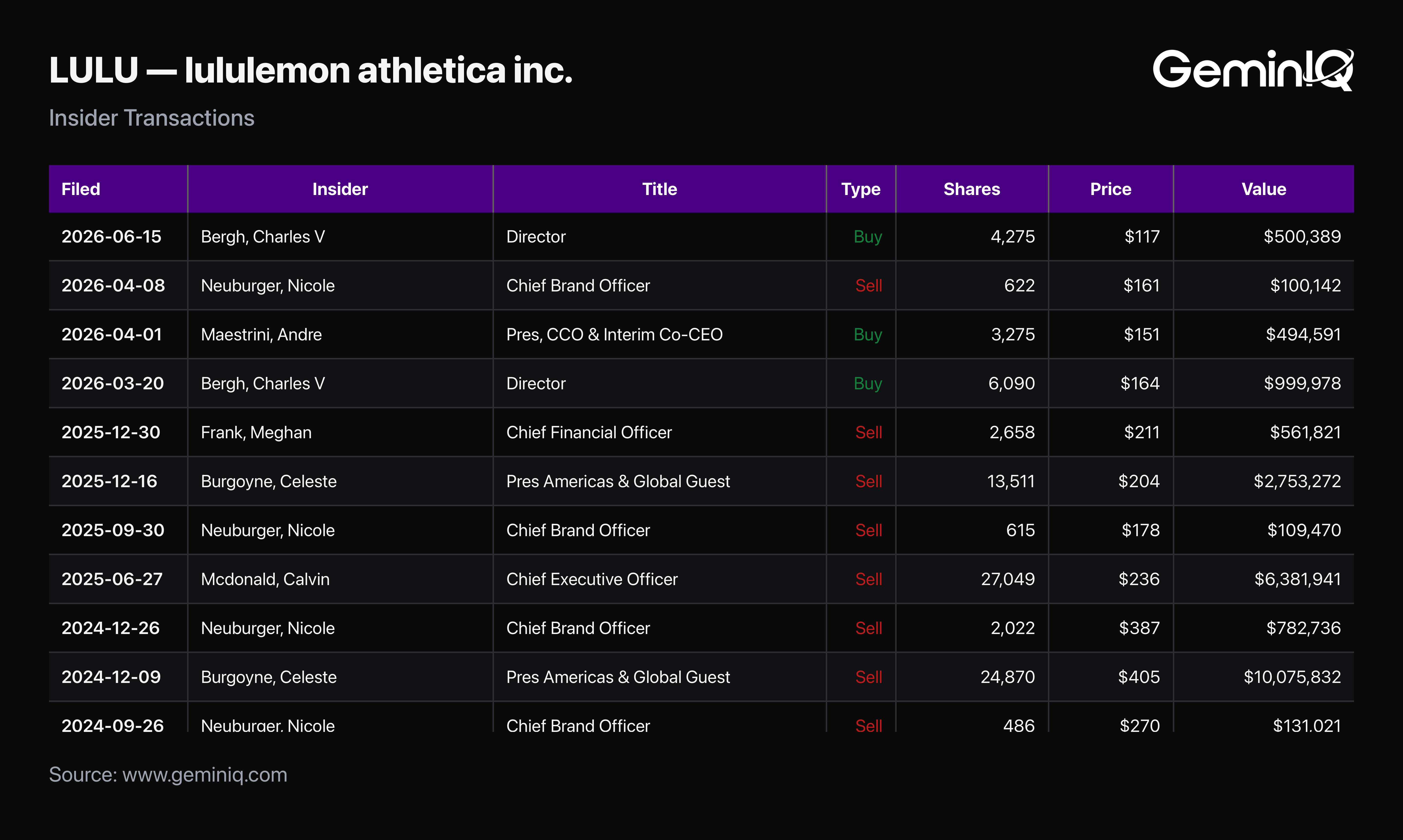
What are the people actually running the company doing with their own money? GeminIQ's Insider Transactions feature pulls every SEC Form 4 filing directly. For Lululemon, the honest read is mixed, not a clean signal in either direction: insider activity over the trailing 12 months shows 5 sales totaling roughly $9.91 Million against 3 purchases totaling $1.99 Million. The sales skew routine and compensation-related, and one line dominates the total: a $6.38 Million CEO disposal in June 2025, which alone is 64% of the sold value. The purchases are the more interesting side. A director bought 6,090 shares at $164.20 on March 20, 2026, then bought 4,275 more at $117.05 on June 15 — averaging down into the decline with his own money — while the incoming Interim Co-CEO bought 3,275 shares at $151.02 on April 1. Form 4 data is filed per transaction rather than continuously, so this is a record of what has already happened, not a live feed.
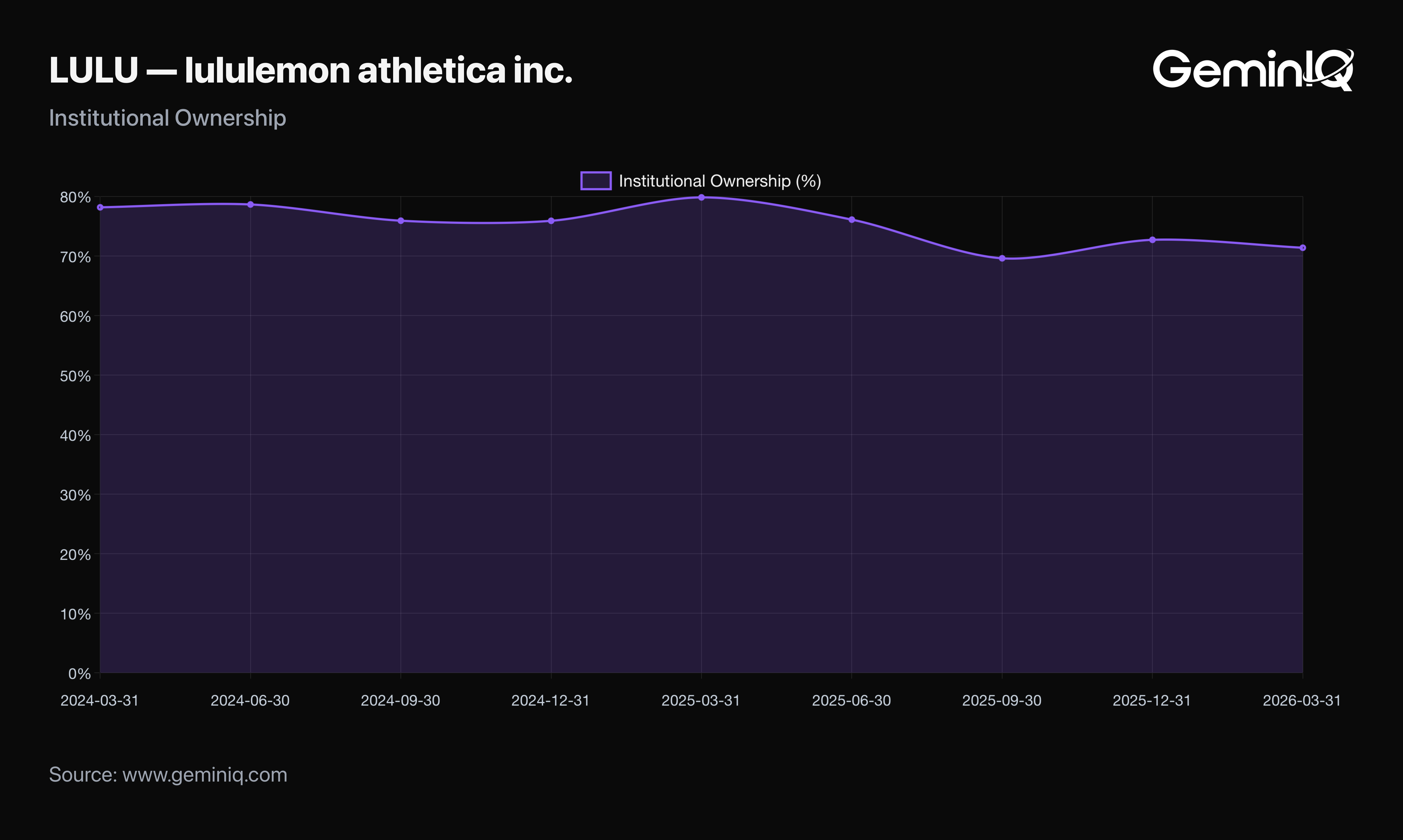
On the institutional side, GeminIQ's Institutional Ownership tracker shows the same lack of a clean signal: institutional ownership has fallen from 79.85% in March 2025 to 71.39% in March 2026, touching a low of 69.62% in September 2025 before recovering to 72.72% by December. That is net institutional reduction across the year, but the trough is behind it rather than ahead of it. A standard aggregator reports only the current percentage; the quarterly time series is what separates "institutions are still selling" from "institutions sold, then stopped" — and 13F data is quarterly and lagged, so it dates the reduction rather than tracking it in real time.
This step doesn't always produce a clean verdict, and Lululemon right now is the case in point — which is itself useful information, because a workflow that only ever confirms the bull case isn't actually checking anything.
Step 8: Verify Every Number Against the Filing
Every metric in this workflow is only as reliable as the data feeding it. Most financial platforms pull from third-party aggregators that normalize, smooth, or reclassify line items before a number ever reaches the screen. The fix isn't a better metric. It's a better source.
Every figure in Steps 1 through 7 above traces to a single document: lululemon athletica inc.'s Q1 Fiscal 2026 10-Q, filed June 4, 2026, for the period ended May 3, 2026. GeminIQ's Financial Statements feature pulls that filing's Income Statement, Balance Sheet, and Cash Flow Statement directly from its XBRL tags on SEC EDGAR, and Custom Tables makes it possible to rebuild any of the comparisons above from the raw line items rather than taking a calculated metric on faith.
A workflow is only as good as the willingness to check it against the source. That's the step most research skips — and the one that actually separates a checklist from an audit.
FAQ
Do value investors need to check every metric in this list for every stock?
No. The order matters more than the completeness. Quality (Step 1) and balance sheet risk (Step 3) are close to non-negotiable for any company, while operational efficiency (Step 6) is largely irrelevant for asset-light businesses and deferred revenue growth only applies to subscription or prepaid-revenue models — it didn't apply to Lululemon at all in the walkthrough above. Skip what doesn't fit the business model rather than forcing every metric into every analysis.
Which single financial metric matters most for value investors?
There isn't one, but Return on Invested Capital (ROIC) comes closest to a starting point, because it measures business quality independent of capital structure and valuation. A cheap stock attached to a low-ROIC business is rarely a genuine value opportunity — it's usually a value trap that happens to also be cheap.
Why do the same financial metrics show different values on different platforms?
Differences usually come down to methodology rather than data errors — how invested capital is defined, whether a fixed or actual effective tax rate is used for NOPAT, how EBITDA is reconstructed when it isn't reported directly, or whether non-recurring items are stripped out before a ratio is calculated. GeminIQ uses as-filed figures from SEC XBRL tags and discloses the exact formula behind every calculated metric — the only way to know which version of a number you're actually looking at.
Wall Street's data. Main Street's price.
Institutional terminals charge thousands a year for as-filed accuracy. GeminIQ gives you the same thing for a fraction of the cost: financials built directly from raw SEC EDGAR filings, not third-party APIs, with full XBRL traceability back to the original 10-K or 10-Q. No normalized guesswork, just calculated metrics, charts, screeners, and watchlists built on numbers exactly as the company reported them. Start researching now at GeminIQ.com.
All financial figures cited in this article reference lululemon athletica inc.'s Q1 FY2026 10-Q (filed June 4, 2026, period ending May 3, 2026). All SEC filings are publicly available at SEC EDGAR.
Disclaimer: The content in this blog is for educational and entertainment purposes only and does not constitute financial, legal, or tax advice. Investing involves risk, including the loss of principal. The views expressed are my own and not intended as financial advice or a guarantee of future performance.